Tweet Comparions
COVID19 and Donald Trump
—
Project Description
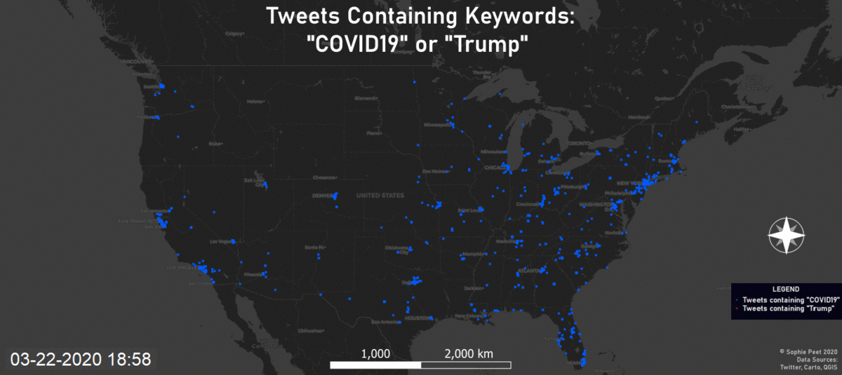
These maps show different ways to visualize tweets. The first is the raw point data, shown in blue are tweets containing “COVID19” amd shown in red are tweets containing “Trump”. The tweets were gathered using the ‘rtweet’ function in R (screenshot of code and download below). I first ran the code for tweets containing “COVID19” and then ran this code again for tweets containing “Trump”. The tweets gathered are all geocoded, include a latitude and longitude, and are not retweets, ensuring the tweets are unique.
We can see that the hot spots for the tweets are along the coast lines, and the places that have been most affected by the coronavirus pandemic in the United States. Another observation to make with the included layer of each state capital, is that even in states where there is a lower population, and population density, there is still a cluster of tweets around most of the capitals. This could be due to a hub of activity and a higher density of people in these areas.
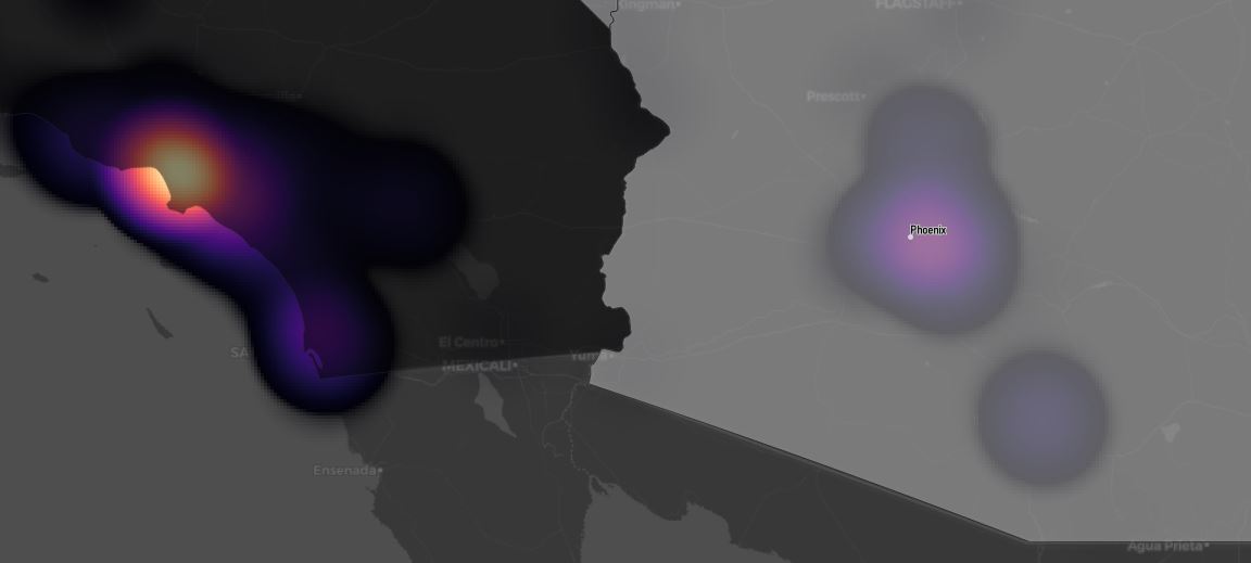
The second map shows these tweets in two more ways. The first way is with the ‘COVID19’ tweets, these are shown as the top layer of the map which is set to be slightly transparent, so you are able to see the heatmap below. These tweets are shown directly on the states as number of tweets per state. Each tweet (as a point) was counted within the bounds of each state. California has the highest number of tweets and right behind (in no order) are Texas, Florida, and New York. The high volume of tweets in California and New York make sense because of the high volume of COVID-19 cases in these areas, the other 2 states are not as big hubs of coronavirus as the other but they have high populations which could be causing a significant amount of tweets coming from these areas.
The other part of this map is a kernel density heatmap which shows density/clusters of tweets with the keyword ‘Trump’. I chose to include tweets that had the keyword ‘Trump” because this is the most likely way to see twitter users talking about President Donald Trump. Though “President Trump”, “Donald Trump”, “Trump”, or “POTUS” all have different connotations and would likely give different amounts and spreads of tweets around the country, and world. The hubs for tweets as shown but yellow, orange, or pink on the heatmap show similar results as the “COVID19” tweets. This is likely due to the state of the country, where many of the decisions being made about coronavirus are related to Donald Trump. Some differences lie in Texas where there is not much ‘Trump’ tweet activity, and there is a stronger presence of ‘Trump’ tweets vs. “COVID19’ tweets further south of NY in the Mid-Atlantic region. A big similarity is that in the northern MidWest area; Montana, Wyoming, South Dakota, etc. there is slim to no tweets on either account, this is mos liekly due to the extremely low population in that region.
Cornonavirus(COVID-19) USA Reference Maps, New York Times
Coronavirus(COVID-19) NYT Github Data Download
Check out a cool timeseries GIF!
Download PDF
Download R Code
Back to Home